Fot. Studio Izabela Bołoz
Exhibitions trying to render Polish design thought as quintessentially good are everything but novelty. However, it’s been the first time for a piece of Polish art to be exhibited in the Netherlands, a country famous for its excellence in experiments and conceptual design. Designing an exhibition, a national one for that matter, is an onerous task. It includes the creation of a coherent narration which finds its rhythm in diversity, and the creation of experience and interaction that could possibly develop a network of potential cooperation and exchange. Context, where and to whom an exhibition is shown, is also of great importance here.
The nature of the exhibition “Polish Design: in the Middle of” shown during the Dutch Design Week was clearly interdisciplinary. Material objects (furniture, pottery, toys, textiles) were presented, as well as applications offering interactive experiences, created both traditionally and with the use of advanced and innovative technologies. Bordering art, design and science. What made the Polish exhibition coherent and outstanding in the Netherlands – the designers’ perfect world?
For Izabela Bołoz, the exhibition’s curator, the starting point in designing the exhibition was the atmosphere of an informal meeting; the urge to strip the typically museum “don’t touch” note of exhibit.
”I am a designer and I made the strong assumption that the exhibition’s conception should be, in the first place, communicative. Visually and perceptively alike. What I wanted to achieve primarily was an informal atmosphere, an interaction. Hence, “living” objects which could have been touched, tablets with applications and well laid tables to sit at, talk, and consume projects. First, there was an atmosphere and a message; tools, with the help of which I achieved that experience, came during the process of working on the exhibition.”
Summing up: the exhibition – Polish, the context – special, the aspect – human and informal. The exhibition’s curator continues:
”I was very much focused on the context of the exhibition. Polish design remains fairly classical, so I desired to show projects which, in a conceptual and experimental design environment, would arouse the audience’s interest. At the same time, the trick was to keep balance between showing the Polishness and the context in which it was to be presented.”

Fot. Studio Izabela Bołoz
The main figure of the event was a table, full of Polish cuisine’s delicacies during the exhibition’s opening , later filled with gems of Polish design to be “consumed” by the audience.
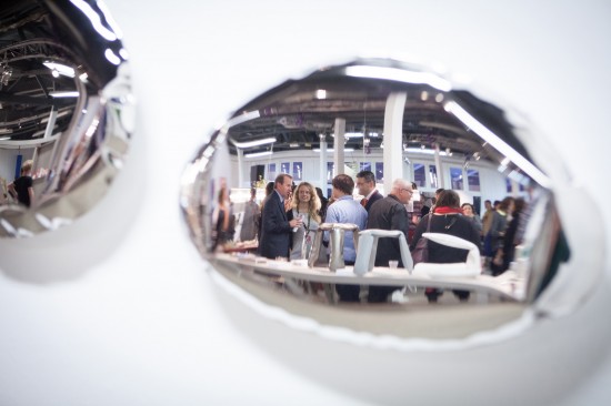
„Pottery, being praised for its quality and sublime aesthetics, turned particularly effective. The artistic and visual values of all the objects were appreciated by the aesthetically savvy Dutch audience. Much attention was paid to fabrics (Gosia Herba’s “Festen”, Kosmos Projekt), and toys and books for children (Boomini, Dwie Siostry Publishing House, Zuzu Toys). Eventually, in practical terms, everything went smoothly. The show was stolen by Oskar Zięta’s steel mirrors, which had their Dutch premiere at the exhibition. Having been made with the use of the innovative technology FIDU, they were a magnet for designers and trend watchers, but also for pottery itself, which symbolically “examined” its reflection from the opposite tables. This dialogue between innovation and the tradition of handicraft resounded very distinctively. ”
Iza Bołoz, who was educated (and now works) both in Poland and the Netherlands (she graduated from the prestigious Eindhoven Design Academy), connects the Polish and the Dutch design reality.
“I see no discrepancy between these two worlds because my design is mainly about an intervention in a public sphere; I’m not having my products manufactured.”
What Iza seeks in designing is a dialogue with an audience, an interaction and a stimulation to act. She usually intervenes in structural landscaping, furniture and urban installations. Her works are the result of the observation of nature, movement, change, social behaviors. The “Shadow City” installation, the “Waiting Room” project, in which she redefined the experience of waiting for transport, and the “Leaning Bench” ,where one could experience sitting on a bench that leaned, are just the few projects of what Iza’s designed so far.
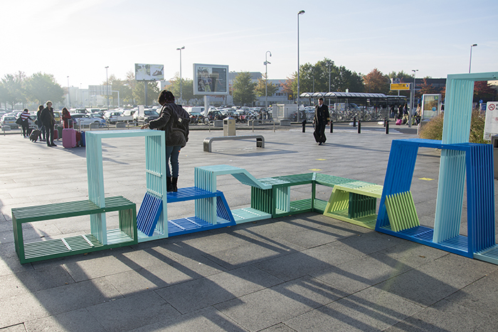
The latest work, the „Intersections”, had its premiere during Gdynia Design Days, but turned out a real teaser at Dutch Design Week. It was situated at the airport and in Strijp T – one of the major exhibition spaces. Its presence welcomed guests and drew their attention.
Fot. Jan Lutyk
The „Intersections” is a system of modular benches which can be randomly pieced together to create various shapes with different functions. The installation was inspired by Gdynia’s modernist architecture and brings to mind the waves, in color and dynamic form alike. “Intersections” serve their purpose perfectly – inspiringly and non-obviously spur the desire to act. They can become something to lie on, a bench, a tunnel, or a game table…
Iza admits that the countless ways in which the shapes can be joined make it possible for the project to multiply constantly. It doesn’t take much to develop it in terms of materials, forms and colors. When I think about the urban furniture appearing chaotically in Poland (the day I had my talk with Iza I saw a new, metal bench next to the old, wooden one; both were set in cement, immovable) I hope that city governors are getting in line to order Iza’s projects.
Let’s return to the exhibition – accompanied by a vast array of workshops and lectures, the creation of which wouldn’t be possible without the help of the major inspiration – Zuzanna Skalska. Apart from lectures on trends and education (Lidewij Edelkroot, Zuzanna Skalska) or process designing (Oskar Zięta) there were sense-branding workshops (Marta Siembab, Maciek Kawecki) as well as both a lecture on and a workshop in designing for kids (Karolina Perrin). Interesting was the clash of views on interactivity: to Perrin, who normally designs for Copernicus Science Center (Polish: Centrum Nauki Kopernik), interactivity means an experience engaging a whole body, not only hands. Hence the treatment of a tablet as one of the tools, by no means interactive.
Has any bridge been built to connect the Netherlands and Poland? Some (designers!) consider the Netherlands to be over-designed and, as a result, almost impossible to live in. To others it’s the designers’ El Dorado, at least from a distance. Undeniably, that country is an ideal source of inspiration from which everyone can draw with both hands, analyzing victories and failures. The fact that something has already been made (e.g. multisensory design) doesn’t mean it cannot reappear in other contexts. Luckily, Poland remains abundant in design niches and areas “in the Middle of”.


